« February 2008 | Main | April 2008 »
March 31, 2008
The UMPC Evolution: Samsung’s Q1 Ultra
Two years ago a cover story in Smartphone and Pocket PC magazine introduced the UMPC, and Samsung’s Q1 was the first to make it to market. At the end of the article, I asked if the new UMPC would replace the Pocket PC, or whether it would even survive as a platform. Samsung’s second generation device shows that the developers have been paying attention to user feedback. The new Q1 has impressive improvements that make it an attractive computing choice. Recently, at the Consumer Electronics Show, I observed several second generation entries and that more manufacturers were coming out with new models. Apparently the UMPC is gaining a significant foothold as a viable platform and computing alternative.
Outside: first impressions
First impressions and appearances reveal significant differences in the new Q1 compared to the original version. Perhaps most noticeable immediately is the QWERTY keyboard split on either side of the screen near the top. On the left is a joystick with mouse and Internet control buttons. On the right, is the navigation panel with an enter button, and below that are left and right mouse button keys.
Viewing the same seven inch screen is a more pleasurable experience now because instead of the 800 x 600 resolution, it has been bumped up to 1024 x 600 eliminating most sideways scrolling.
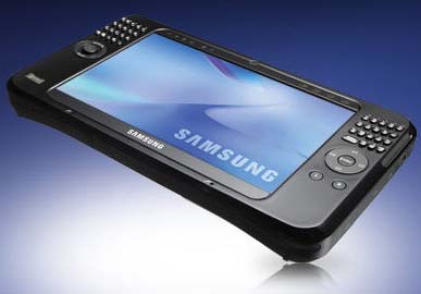 Another new feature is the fingerprint scanner on the lower left corner of the front panel. Instead of no camera on the first Q1, there are now two cameras, one in front, one in back.
Along the top, above the screen to the left are a series of indicators for power, battery, and wireless connections. On the left is a bank of four buttons for volume, and a menu for various system controls, and a handy UDF or user defined button. There are dual microphone pinholes at the bottom of the screen. A button that activates the camera is on the top right.
Gone is the CF port replaced by a standard SD card slot on the top of the unit accompanied by a 3.5 mm earphone jack and USB port. On the left is a lanyard connector, an AV Station button, and a locking power slider.
On the right side is the power input and a removable cover housing LAN, USB, and VGA ports. On the bottom right corner you will find the stylus silo. On the backside, there is a battery cover latch and a foldout stand.
Inside
Samsung has improved what’s under the hood too with more hunk and computer power by installing an Intel Core2 Duo ultra low voltage 800 MHz processor and one GB of RAM. Unfortunately, the review model I received came loaded with XP, but it will start shipping with Vista in the second quarter of 2008.
The LCD 7 inch WSVGA screen is set to 1024 x 600. For audio it offers H/P out, stereo speakers (1.5 x 2) and array mic.
It sports an 8mm, 1.8 inch, 60 GB hard drive for built-in memory plus a standard SD expansion card slot.
The wireless setup includes WLAN (802.11 b/g), Bluetooth, Wired LAN (RJ45), and optional HSDPA/WIBRO, but no InfraRed. I/O ports include H/P out, DC-in, USB x 2, VGA, SD slot, RJ45, and SIM CARD (HSDPA) slot (optional).
User interface features include a QWERTY key pad. Dial Keys, Enter, Mode Switch (Joystick, Mouse), Shutter/Internet, CAD, Meun, UDF button, MIO, Volume +/-. It facilitates multimedia instant on with hot-start.
Other features include fingerprint scanner and dual camera. The unit measures approximately 9 x 5 3/8 x 1/ ¼ inches. It weighs one pound, 14 ounces, which is a heck of a lot less than a laptop.
In the box
The contents of the box are rather minimal. There is an AC adapter, a set of ear buds, and a nylon sleeve case. There are two CDs. The System Software Media disk was not compatible with my Vista desktop, so I could not run it. The System Recover Media disk was dated 2005, curiously before the advent of the first UMPC. Let’s not forget the wrist strap. And that is it. If you want to accessorize, the rest is up to you. There is no printed or CD manual. There is an icon on the desktop that takes you to an onboard manual that is somewhat comprehensive.
Samsung has several accessories available, which include a navigation pack for GPS (car cradle, car adapter, GPS receiver, map), USB external keyboard, and extended life battery of 8.5 hours. The standard battery has a predicted 4.5 hour usage. There is an optional external optical drive and a docking station.
Software
The unit comes with an array of software to assure your productivity right out of the box with the usual compliment of XP and Microsoft components from games to utilities and applications. Samsung has plugged in some of its own useful tools, and there is some third party software as well.
I think it is too bad that you only get a trial version of Microsoft Office. When the trail expires, I will probably take advantage of Google’s free software alternatives or OpenOffice.
For the Tablet mode, there is Windows Journal for pen input and Microsoft Touch Pack for Tablet PC.
Observations
I found the new keypad awkward to use, and difficult to see without a backlight because of glare from the shiny black surfaces. I never did like the dialkey alternative, which is still available for those who wish to use it. The input panel works well enough with a stylus if you prefer it. However, any serious inputting should only be attempted with an external keyboard, USB or Bluetooth.
My ThinkOutside Igo Bluetooth keyboard paired right up using the native driver already onboard. It worked really well, and turned the UMPC into a real productivity device that I would be pleased to take anywhere. But, without the keyboard, its usefulness is more limited.
Unfortunately, I am one of those leftys who drags his hand behind the pen tip and smears the ink. Accordingly, when I try to write on the UMPC screen I create a pickup sticks of jagged lines on the screen, and my writing goes mostly unheeded by the system. I doubt that right-handers would have this problem if they don’t touch the screen with anything but the stylus. So, for me, the Tablet PC approach with the digital pen works better for handwriting. But, I actually prefer the convenience of the touch screen.
The screen has greatly improved for outdoor viewing. Before it was like looking into a black mirror. Now you can adjust the backlight.
The joystick is so sensitive, that it is just plain annoying. Thank goodness for the touch screen. Use your finger or a stylus instead for efficient precision pointing. For best results use a USB or Bluetooth mouse.
No, I do not think the UMPC will ever replace a Windows Mobile Professional device. Even though it is eversomuch more powerful, it is still bulky in comparison and far less convenient. The real question is whether it may replace a laptop or Tablet PC.
The answer to that question probably lies in the way it will be used. It is a wonderful device for portable, handheld inputting for inventory, medical forms, and other repetitive tasks. I certainly would not want to take extensive notes or write a novel on one without an external keyboard. Its lack of an optical drive could be another problem for some users.
But, by the time you pack an external keyboard, mouse, optical drive, and cables, you may prefer the convenience of having a laptop or Tablet with a larger screen.
I have enjoyed the convenience of size and found the 7 inch screen perfectly adequate for inputting if I have an external keyboard. I have used it for PowerPoint presentations and appreciate its small size on the road. I really like its larger screen for GPS applications on trips. It’s a great media center too. I like to put it in my kitchen while cooking dinner and watch TV via Slingbox or look up recipes, or talk on the phone via Skype or plug in my MagicJack and yak away while I burn the beans.
What about price? I have seen the price vary from $779 to $1099, which is quite a variance. But, at $799, I should think that even with laptop prices dropping dramatically, this UMPC is definitely a buy worth considering. It is not yet at the $500 level that Microsoft envisioned initially, but perhaps it will be as consumer demand increases.
I would recommend waiting for one pre-loaded with Vista unless the XP units are substantially less. It is strange that I should receive an XP review unit when I saw them with Vista at the Consumer Electronics Show in January.
Certainly there is a place for the UMPC platform. I am happy to see it maturing and expanding. Samsung, the first to enter the market, has made another valiant entry with its second generation Q1 Ultra.
Posted by conradb212 at 01:47 AM | Comments (0)
March 24, 2008
SMS-Chat Revisited
When I first tried SMS-Chat I was enthusiastic about it because it was fun, flashy, and new. I also liked the finger scrollable screens. But, after having used it now for a while, I am beginning to develop a wish list for the next version.
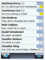 While there is much to like about this creative chat program that automatically threads your messages by recipients for convenience, there is room for improvement to make it even better.
First of all, I would like to see this application have a robust settings menu that would include such choices as font type, font size, font color, background color, and themes.
Leaving color and style behind, there are much more important functional considerations. Perhaps my biggest wish would be for the ability to highlight/cut/copy/paste. It’s nothing less than maddening not to have these normal, expectable functions available. It should also have automatic first word of a sentence capitalization as an option. “I” and contraction words should automatically be capitalized as well. Why is there no predictive text engine for faster inputting? Why not just use the one that comes built-in?
Another serious shortcoming is the lack of hyperlinks. I often send a hyperlinked URL to associates, and that is not possible with the current version of SMS-Chat. It is perhaps because of this single factor, more than any other, that I have returned to my tried and true faithful Treo with it superb built-in SMS and MMS applications.
I’d like to be able to sort messages in certain ways and to tag and group them in other ways. I’d like for there to be an auto text module for pat phrases such as out of office, call you later, on the phone, etc. There should also be a nice gallery of emoticons available for quick input to spice up messages. It would also be worthwhile to have a larger input panel. The send button could be a softkey at the bottom of the screen.
While it is sometimes convenient and desirable that a new message automatically pops up on your screen, there may be other times when it is totally inappropriate. Accordingly, this feature should be an option. Similarly, there are times when it may be desirable to encrypt messages. This should also be an option for security purposes.
It would be convenient to have a call button should you wish to place a quick call to someone who just texted you without having to get out of the program to do it. It would also be desirable to be able to zap in a signature when you wish.
As long as we’re thinking expansively here, why not include an MMS module as well for sending graphics and audio along with text?
While I like the way SMS-Chat becomes part of the messaging tree menu, I think it would be better if this program automatically integrated all pre-exising messages into it and simply merged with the existing message tree as the one and only Test Messaging choice. At least this could be an option in case you wished to keep your previous messages separate or use it as a separate service.
Another feature I would like to see is the ability to sync messages with a companion desktop program. Perhaps this could be sold as a separate module. The desktop version should also have the ability to send text messages singly and by broadcasting to an entire list. I believe this operation alone could have tremendous commercial application and could sell for a significant sum.
I have great respect and admiration for the developers at Vito Technology. I consider them to be major contributors to innovative, functional, and fun software for the Windows Mobile market. I hope some of these suggestions will serve to make the next release of SMS-Chat even more useful.
Check out SNS-Chat at Vito Technology.
Posted by conradb212 at 08:15 PM | Comments (0)
March 18, 2008
To Plus or Shell: that is the question
Spb Software has two excellent Today screen launcher type programs with a great deal of overlap. Which should you choose to enhance your pocket pal?
Clearly, Pocket Plus is the more robust in features, but Mobile Shell is prettier and combines fun with function.
Pocket Plus Features
 In my quest to make this evaluation and come to some conclusion, the moment I installed Pocket Plus I remembered why I stopped using it some time ago even before the advent of Mobile Shell. The reason was simple. It requires that you install it to main memory, and that real estate is just too valuable in my estimation. However, I must say that the latest iteration uses a much smaller footprint, so I thought I’d give it another try.
Without attempting to write a user’s manual, let’s review some of the manifold features in Pocket Plus. It is designed to be a Today screen ad-on that accommodates several of its own plug-ins such as Pocket Weather, Diary, and Phone Suite.
It basically displays up to six tabs on the Today screen that allow you to add any custom content you wish from system functions to files, folders, and applications. You can even nestle folders within folders or group related applications. You can customize the appearance and arrangement too. The tab contents appear on the Today screen for easy access.
What I really like about the Today screen view is that you can organize the icons by dragging and dropping where you want them, a function sadly lacking in Shell where it’s tedious to organize, add, and subtract items. Plus makes all this a breeze in comparison. You can even drag icons from one tab to another. However, I discovered that Plus does not make all applications available, which is disturbing.
A handy optional battery bar indicator appears across the top of the taskbar that takes up virtually no Today screen space.
The built-in task manager is customizable with up to 18 functions compared to Shell’s 5 basic functions. It will actually close programs and not leave them running in the background using up system hunk.
Plus adds finger-friendly scrolling to many applications such as File Explorer, Messaging, PIE, Outlook, Programs & Settings, and Search, as well as for many Spb programs. This should make nose miners who like to use their index fingers happy.
Plus also adds the ability to program buttons by adding a tap and hold feature that doubles button functionality. In File Explorer, Plus adds a zip/unzip files function to conserve space. It will also encrypt files for greater security. It offers a properties option, formats expansion cards, and lets you add items to the today screen just like on desktops. It even lets you rename file extensions. The improved file open/save dialog allows you to browse to any directory from within any application.
If you are having issues with your system, Plus allows you to boot in safe mode to mend the problem. You can set it to open automatically after three failed boot attempts.
In Internet Explorer, Plus adds the ability to push the screen around just like in iPhones. It also lets you create tabs as you would on a desktop browser.
Mobile Shell Features
Now let’s take a look at what Mobile Shell will do for you. For a more complete discussion, check out my review of the newly released version 2.0 at http://www.pocketpcmag.com/blogs/index.php?blog=9&p=2530&more=1&c=1&tb=1&pb=1#more2530
Basically, Mobile Shell offers features contained on three screens.
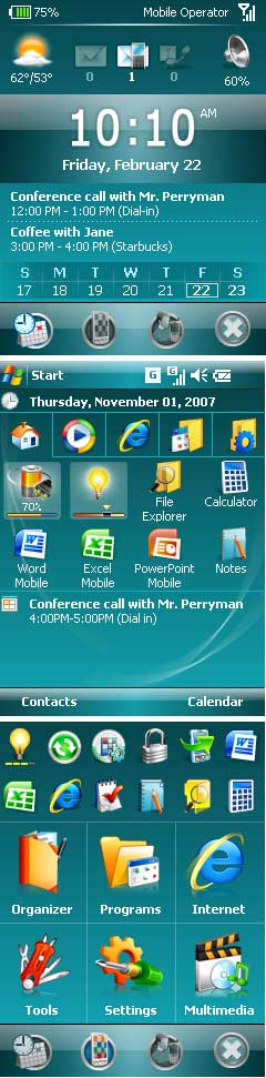
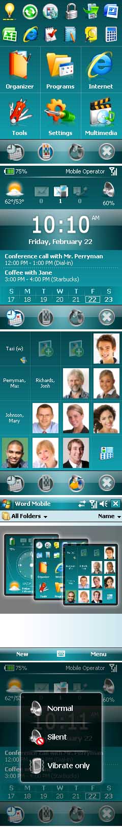
On the Now screen put up in the Professional view of Shell, you will find weather, message, and phone configuration info at the top. A large digital time display with date dominates the center screen. Below that are upcoming appointments with a calendar bar showing the days of the week. Tap on any day to bring up the day’s activities. At the bottom are four icons. From left to right the first one will take you to the Now screen, the second to Shell’s main navigation or menu screen, the third to a photo contact/speed dialer screen with 16 programmable spots on a 4 x 4 grid, the last icon functions as an OK button that takes you to the previous application.
The Navigation screen consists of a menu six large icons containing related programs. The standard arrangement features Organizer, Messaging, Tools, Programs, Settings, and Multimedia. You can add or subtract and even create a custom button called My Menu and put anything you want in it.
At the top of the screen are 12 more smaller icons representing the most recently and commonly used applications. You can rearrange these, add, subtract, or pin them permanently to a position.
The third screen already mentioned is the speed dialer.
A neat feature of Shell is the ability to gesture with your finger or stylus to bring up these three screens from any application, which is a huge plus lacking in Plus. All you have to do is drag your finger or stylus downward from the left half of the taskbar.
The icons are large and finger friendly for quick and efficient navigation in Shell. The inspiration no doubt came from Smartphone screen layouts. I like it and find it easier to use than Plus’ approach. If you put too many icons on the Today screen in Plus, they disappear off the screen, and there is no way to scroll to them. This is surprising given Plus’ scrolling abilities elsewhere. If you make the icons smaller, they are difficult to see and to identify. You can add labels, but that takes up space.
I found that when I tried to use non-Spb plugins for the today screen the system would get hung up. I even had difficulty using Spb plugins with Plus on the Today screen. So, phooey with Plus on the Today screen.
Conclusion
What to do? Which one to choose? I hated to give up all that super functionality of Plus, but I would not mind regaining the main memory it takes. I love the finger-friendly big icons for easy navigation in Shell its handy speed-dialer, and all the information on the Now screen. Decisions, decisions.
Finally, I realized that I could have the best of both worlds. I simply disabled Plus on the Today screen by unchecking the box in the set up menu. Voila, I have all the super functionality of Plus running in the background and the great navigation and information on Shell’s attractive screens available in the foreground.
I also added feature-rich Spb Diary, a plugin that displays PIM data with Calendar, Tasks, Contacts (with photos), Notes, Messaging (emails & SMS), special events such as birthdays, and a custom tab—all with easy finger-friendly, one-hand navigation on the Today screen.
I decided to include Spb Phone Suite as well because it offers profiles, missed calls and SMS notification, photo speed dial, wireless manager, call filtering, customizable Today plug-in and more.
And that’s how I decided whether to use Pocket Plus or Mobile Shell, and I’m as happy as a leprechaun in a Guinness brewery with the super combined functionality of both great products.
Keep connected…Happy St. Patrick’s Day
Posted by conradb212 at 04:26 PM | Comments (0)
March 17, 2008
AstroNavigator v2.01
What I would have given for AstroNavigator when I was earning my Boy Scout Astronomy Merit Badge. With Astronavigator on board and hooked up to a satellite feed, you just face in any direction, and a picture of the heavens will appear on your screen.
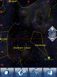 You just tap on any object, and a screen appears with information about it. You can search for and locate any star, planet, galaxy, or constellation.
Recently AstroNavigator acquired a new look with animated screens and finger-friendly screen flicking, inspired no doubt by iPhone. In fact, Vito Technology has created a whole family of finger-friendly applications for nose miners.
I was surprised to receive a notice yesterday that Vito Technology has released yet another version of AstroNavigator.
Some of the improvements include the following:
· Database loading time is significantly faster.
· Searches for stars, constellations, and towns, etc. is faster too.
· Information about heavenly bodies and constellations appear in separate windows.
· The application displays animated images of celestial objects.
· You can now view not only objects above you but also from anywhere on the planet.
· T9 is available to facilitate more efficient searches.
· You can change the time and date of the viewing screen.
While all of these innovations are definite enhancements to an already exciting product, the one that shakes my shovel (I’m an archaeologist) is the latter. It has been my greatest fantasy to be able to travel through time and space since I was a little boy. Now I can, thanks to Vito Technology.
The only problem is that I await clear skies to be able to put it to the ultimate test of actual viewing. Meanwhile, I’m having fun playing with it by traveling through time and space and venturing to other locations to see how the night sky appears from various exotic viewing points.
I’m not much worried about writing this piece before I have a chance to use it under clear skies, for I have been using the program for many years now and have complete confidence in it.
This application is a must have for all star gazers or would be star gazers out there. With AstroNavigator, you are certain to become star-struck. It’s a great investment that will advance your knowledge and appreciation of the heavens above us, past, present, and future. How else can you turn into a time tripper for only twenty bucks?
If you want to earn your Astronomy merit badge or become a time traveler, go to www.iwindowsmobile.com and grab a copy. Of course, you can try it free before you buy. I wonder when McDonalds is going to discover this concept?
Posted by conradb212 at 02:15 PM | Comments (0)
March 14, 2008
SPB Weather Release 1.7.4
Spb Weather is clearly one of the top weather programs available for Windows Mobile devices. If you are already a user, you will want to take advantage of this free upgrade. Otherwise, you may wish to check it out and add it to your bag of tricks.
The main incentive for upgrading is that the new version integrates seamlessly with the new Spb Mobile Shell 2.0, as well as Spb Pocket Plus and Diary. See a review of Mobile Shell.
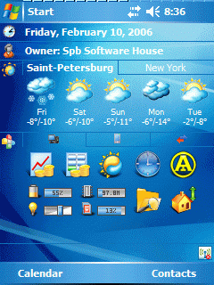 Let’s take a brief tour of this pocket weather station that can reside on your Today screen or a tap away nestled in Pocket Plus or Mobile Shell tab or icon if you want to conserve the limited display space available. It offers four views ranging from 4 to 7 days depending on the information you want to view at a glance. Tapping on a day’s icon will bring up the detailed forecast for that day to show weather for Morning, Day, Evening, Night, which is handy. If you want to compare your designated weather cities, you can display them in a multiline view. Otherwise, cities reside on tabs.
Selecting your favorite cities is easy from the provided database, or you can specify your own. I’ve never been stumped yet. You can use the weather services available in Spb, select or create your own, a powerful feature.
It’s skinnable and comes with 10 professionally designed options. You can download more for free from Spb, or you can create your own. This allows you to change the weather icons to the ones you prefer.
Spb Weather allows you to specify measurement and unit settings and to synchronize in different ways to keep reports current.
If you are interested in exploring the features of several popular weather programs before making a decision, you may wish to read my article “Weathering Heights.”
You can download a free trial or purchase it at http://www.spbsoftwarehouse.com/products/weather/download.html
Spb Weather costs $14.95, which is a small price to pay for instant and up to date access to vital information that can sometimes be a matter of life or death.
Posted by conradb212 at 03:03 PM | Comments (0)
March 10, 2008
SPB Mobile Shell 2.0
There’s a whole host of new features in the latest release of SPB Mobile Shell. It seemed to me that it hasn’t been that long since it first appeared on my Windows Mobile screen, but I guess it was actually a year ago this month. How time flies when you’re having fun with your pocket pals.
 When you install the program, you have the choice between the Professional View or Classic View for the Now screen that appears when you first turn on your machine. Accustomed to the Professional View, that’s what I selected because it gives you a digital clock and a lot more information than the classic analog clock view.
The new Now screen in Professional View popped up with some innovations. From top to bottom there are several horizontal ribbons containing vital information. At the very top left, you will see a battery life display opposing a notation of your phone network and connectivity strength on the right. The next row of icons, from left to right displays the weather for your selected city, number of unread emails, text messages, and voice mails followed by the sound level and phone mode (normal, silent, or vibrate). Tapping this icon allows you to change the mode. Basically, SPB attempts to cluster the most important information for you on this screen all available in a glance.
Note that the selection of cities for the weather display is unfortunately rather limited. The closest city I could find near where I live is 100 miles away. This features needs to be improved. However, the new full-screen weather page that appears when you tap the weather icon is very nice with its four day forecast and current day/night/morning/evening conditions.
Next comes the time and date panel prominently displayed, which I appreciate. It has become the way I usually tell time. The bands beneath that display upcoming appointments. A calendar bar at the bottom will allow you to pull up a week’s worth of appointments for any given day, another useful improvement.
At the very bottom is a brand new row of four, finger-friendly icons. From left to right, the first icon will return you to the Now screen. The second icon pulls up the SPB Mobile launcher screen. The third icon is another handy innovation for it allows you to program up to 15 contacts by name or photo for quick dial, which is far better than the old version with only four or five. Finally, there is an X icon, which acts like an OK button that takes you back to the previous application one by one.
Let’s talk about the mobile launcher screen for that is the heart of the program, and it has been severely redesigned. At first, I didn’t like it. Gone was the familiar 3 x 3 grid with nine handy menu icons that contained the most useful applications nested in categories for easy access. Instead there were now only six major icons. In the place of the missing first row of three large icons, there are now twelve small icons representing the last and most frequently used applications.
What I didn’t appreciate at first was the fact that you can tap and hold any of these icons and then pin them to the screen. You can move them around or delete them entirely. You can also select and manage the pinned items and completely customize what appears here. This is reminiscent of the My Menu folder, which still exists, by the way.
Now that there are only six icons on the main launch menu, you have to select which ones are the most important to you. You may choose among Organizer, Tools, My Menu, Programs, Settings, Multimedia, Messaging, and Internet folders. Each has applications within that you can also change (except for Settings). To reorganize these folders, go to Settings, Customize Menu, and then move them up or down. The first top six will appear on the launch menu screen.
The Version 2.0 menu offers both programs and actions. For instance, in the Organizer folder, the Calendar submenu presents a convenience way to create a new appointment or check your calendar at various levels.
My advice is to place the My Menu folder among the six icons and then place whatever items you want in there for quick access. You can even build a custom menu with sub-folders.
There are many ways to customize SPB Mobile Shell to your own specifications. Go to Settings, Spb Mobile Shell where you can select the following tabs: Now Screen, Today, Animation, Tabs, Advanced, Theme, and Weather. The Animation options are new and fun to play with. The Theme choices really change the appearance and mood of your device. Experiment.
Another new feature for version 2.0 is the ability to use Smart Gestures for navigation that give you even more control and quicker access to the depths of your device. This is really a powerful feature because it allows you to use the gestures from within almost any application to activate the three SPB panels: speed dial, Now screen, or launcher. All you have to do is drag your finger from the left half of the taskbar straight down. The three panels will pop up. Select the one you want, and release your finger. To cancel, just release your finger outside the gray area. Actually, it doesn’t work in every single application, only the ones that display a taskbar.
While I was perfectly happy with version 1.0, I am elated with version 2.0 and its new functionality. I think you will be too. I recommend that you give it a try and suspect that once you have it onboard, you will want to purchase it and make it yours. If you’ve never had the pleasure and experiencing all that SPB Mobile Shell can do to streamline your mobile device, you have a treat in store.
If you already have version 1.0, you can upgrade for $14.95; otherwise, it will cost you $29.95. Of course you can try it free before you buy. Check it out at www.spbsoftwarehouse.com.
Congratulations, SPB, you have created another keeper. I wouldn’t want my Windows Mobile device to be without it. Of course, it goes without saying that this finger-friendly screen flicker only works on touch screen devices.
Posted by conradb212 at 06:57 AM | Comments (0)