 Current Cover
|
|
Looking at the new screens more closely by Shawn Barnett May 1, 2001
Given that many users may be concerned about the new m505 screens, I thought it might be helpful to do a controlled
study on screen viewability in different lighting situations. Screen readability is a difficult thing to test, and it's further complicated by
the considerable number of variables in such an endeavor. Different screen technologies are better in certain situations than others.
Some are better tilted this way and that, and some have their own light source, so choosing a standard situation and even a
posture for the screen is difficult. Because I'm always trying to make the screen look as good as possible in screenshots,
taking a bad picture on purpose is also a challenge. Cameras see differently than eyeballs, and automatic cameras are
always trying to make the image as nice as possible, so there's another variable, though it can at least be made consistent
by switching to manual mode and setting exposure based on an 18% gray card. The final variables are the camera's output and
your monitor's settings. I can't do anything about the former without raising questions about my own monitor, and I can't
make any changes to your monitor. We'll just have to live with what we get, and hope that the single exposure settings
at least give us a stable benchmark.
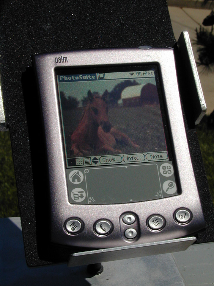
I did two setups for this test. One was indoors, another outside in full sunlight. The indoor test was done about 2.5 feet from two windows
with open blinds at around 12:30 in Northern California on April 30, a clear sunny day. Shots were taken at 1/8 second, F2.8, ISO 100 setting with
an Epson 850z. Unfortunately for the purposes of this test, the Epson does enhance the colors a little and increase the brightness. Rather
than do anything to fix it, I processed the images only for rotation and size and saved them as moderately compressed JPEGs. Know that to at least my
eye, the screens were about 10-15 percent darker when captured than they appear on my calibrated LaCie monitor.
The units were mounted on an old Newton Hi-Rizer stand, and
every effort was made to keep them at the same angle for all shots. I endeavored to eliminate glare from the equation with a large matte
black card, since no benchmark for glare exists. Factor significant glare into the reflective screen designs (m505, iPaq, monochrome screens), and
only outdoors does it usually apply to transmissive designs (Palm IIIc, Visor Prism, Casio E-125). I worried that reducing
glare in this way would be a problem for reflective designs, since they would have less light available to them, but it
turns out to be a good scenario for the half-lit room with darkened walls or clothing around. Wearing a white shirt instead of a
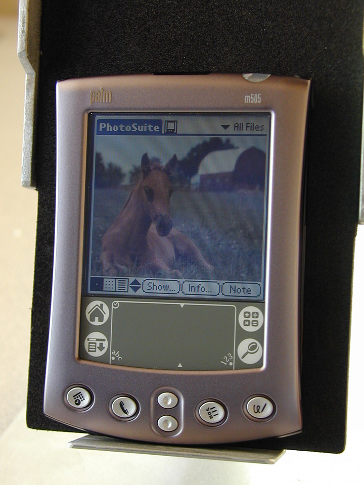
black one has little effect on how viewable the m505 or iPaq screens perform. Indoors, both a non-backlight/sidelight and a backlight/sidelight shot were
taken. In the case of this test shot, the m505 actually looks passably good in the sidelight test. Add a little light and take off that 10 percent, and you can see where
we start to have problems. The problem happens when the room's ambient light causes your eyes to stop down, and then the sidelight appears considerably
less effective. With the color TFT screens, remember the brightness can appear blown out on some, but that's only as it compares to
the camera's settings. Normally, your eyes would be able to compensate. For these, since they're always backlit, I went for the brightest and lowest setting.
Outside I again shot the products at a set aperture and speed (1/670 second, F11, ISO 100), with the angle optimized to give the m505 the best showing possible.
For a few of the monochrome screens, I ran into the problem of the screen refresh rate conflicting with the higher shutter
speed. Consequently, the normally beautiful HandEra 330 screen looks washed out, with a black band across the lower middle of
the screen. Go with the contrast of that black band, and you have the actual contrast. This also appears to have affected the
Visor Edge and 7x in a more limited way. Rest assured that with the normal human refresh rate of around 30-35 samples per second, these screens
would have beautiful black pixels. The color TFT screens are indeed black outdoors, though they are set to their highest brightness. No error there.
In the end, I'm not sure if this will be helpful, but you can't say I didn't try. My only disappointment is that I didn't have the Sony CLIE 710 here for testing.
My analysis is that the m505's sidelight is insufficient, but would be fixed if the users could do two things: set the sidelight to be brighter
(presuming that this is possible),
and decide whether the sidelight comes on by default or only when activated. As it is, it must be activated each time the unit is powered on.
(click on the image to enlarge)
See the links above right for other comparisons, especially how the m505 compares to the iPaq and the new Sony CLIE N710C.
|
|
| |||||||||||